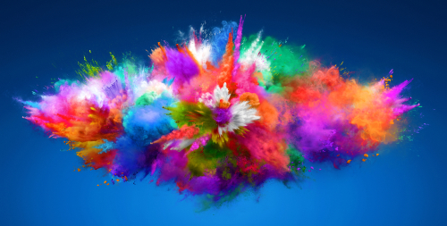
The psychology of color in home design is a hot topic these days as homeowners are putting more effort and thought into their daily surroundings. While the many ways our moods respond to color are subjective (resulting from our life experiences and natural preferences) there are some general responses to colors that are similar across age, culture, and gender lines.
Before we dive into the psychology of specific colors, though, we should note that often color names are just as significant, and sometimes more so, than the hues themselves! That is, while “brown” may be seen as rugged, masculine, or drab, “mocha” and “chocolate” are rapidly associated with warmth, comfort, and contentment.
Therefore, featuring descriptive and evocative color names prominently on your sample displays will help your customers respond positively to your featured product samples.
After more than a decade of interior designs awash in pale neutrals, many young homeowners are finally eager to incorporate bold colors. Red is a dramatic color that is associated with passion, appetite, and action.
Customers who are searching for a way to add a pop-art feel to a room will gravitate to red, as will those who are creating colorful kitchens and creative home offices.
Flooring: Tiles that feature bursts of red within their patterns are ideal.
Fencing: Redwood and red cedar are selling well, but a rich red stain can add depth to any wood.
Siding: Red siding is always popular, especially for smaller homes or rural farm-style homes.
As a combination of red and yellow, orange blends the energy of red with the cheerfulness we often associate with yellow. As a result, many people feel like orange is a great way to combat sluggishness or push beyond grief.
If your customer is interested in adding touches of orange in an existing neutral space, it can make a beautiful accent wall, cabinet color, or flooring color in an otherwise neutrally colored room. This can range from muted terra cotta to full-on Florida Orange depending on your client’s preference.
For countertops, we love a natural orange like sandstone to add a perpetual glow.
Yellow is associated with happiness, sunshine, and citrus, making it ideal in a great many interior designs.
Paint: Yellow nurseries are perfect for babies of either gender, especially because other “baby” tints are going to look beautiful against it. Whether pink, lavender, green, or blue becomes the baby’s signature color, you just know it’ll pop against a yellow background.
Tile: Yellow kitchens have been popular in the US for at least 100 years, and they’re still going strong! Yellow tile floors or backsplashes will give a kitchen an active, homey appearance.
Flooring: Yellow vinyl floors appeal to retro style enthusiasts, and make great starter floors for children and playrooms. In bathrooms, yellow vinyl can brighten up small spaces and add a feeling of cheerful daylight in a bathroom lacking natural light exposure.
Siding: While neon yellow siding isn’t flying off the shelves, subtle golden hues are a much easier sell due to their ability to create a feeling of warmth and welcome.
Are you creating sample displays for some of your company’s boldly-colored offerings? Give us a call to begin the collaborative sample display design process. We believe that strategic color combining can be the key to drawing your customer’s eye to your newest and best product offerings.